Geeky Cool: DC Comics New Logo
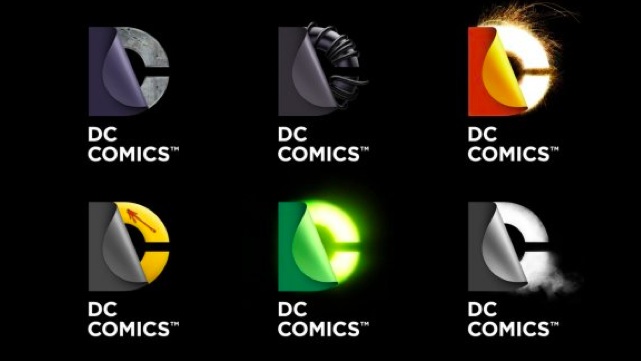
Last September, DC Comics did something controversial. They relaunched their whole universe (well sort of- not completely but mostly). Just after the hardcore DC fans began to settle down and some of them enjoying the new universe,DC has stirred up more controversy. Today they officially unveiled a new logo or actually logos.
Normally a new logo would not stir up too much trouble. But when you have just messed with the emotions and beloved characters of your readers, something that should be minor as logo change can cause fans to get upset.The new logo (and the various versions of it) is extremely different from what comic fans are used to. DC has had several various logos over the years but this one is a bit drastic of a change. Most of the previous changes have been slight. See the below image to compare previous logo.

I am more of a Marvel Comics guy. The Marvel logo has changed some over the year but very little. The logo has changed colors and has had the word Comics in it at times and not at others. But it is more consistent than DC’s logo over the years. I would like to think that I would not care one little bit if Marvel revealed a new radical logo but I would probably have my shorts in a bunch just as some DC fans do currently.